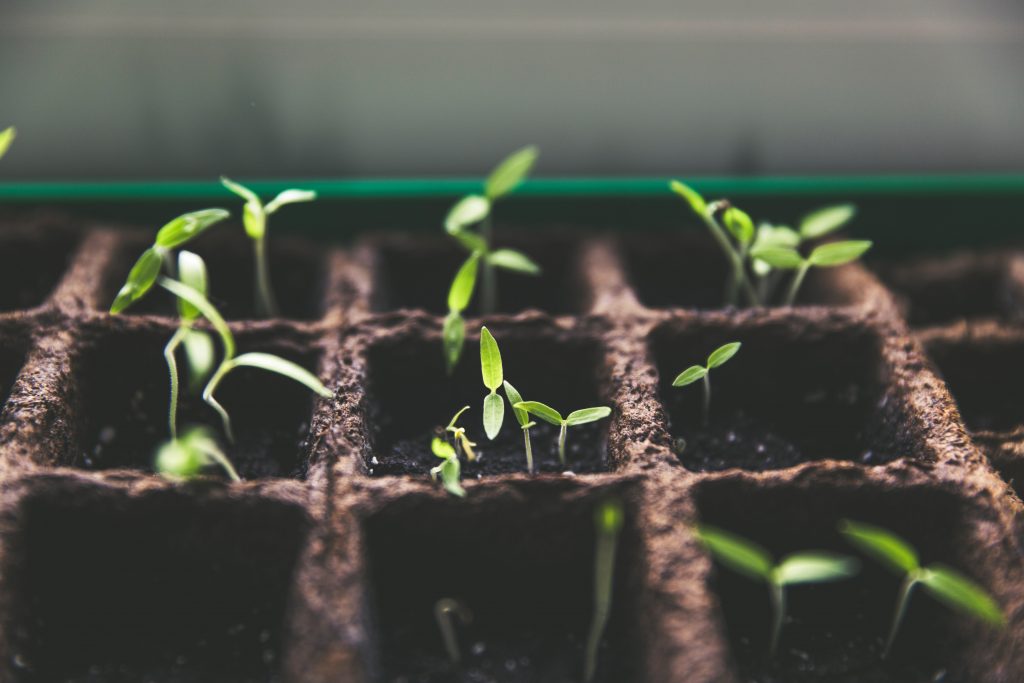
I chose this image because it is growing season, and it speaks to me personally as I am in a season of growth. We all grow at different rates and through stages, much like the tomato plants in the image.
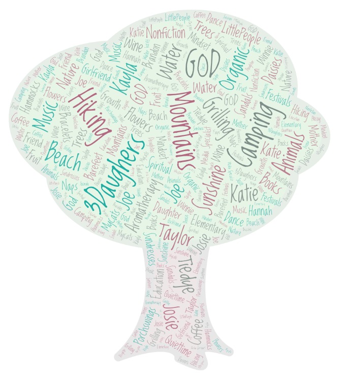
In my media center, we talk about growth mindset a lot, especially at the beginning of the school year and then again at the end of the school year. After a lesson or two on growth mindset, I would instruct students on the proper use of using images on the web and talk about our responsibilites as digital citizens. I would then have the students find an image that portrays their current mindset. I would model how to cite the image and have my students attempt to cite the image they selected. Students would write a brief explanation of the image and how it speaks to their current mindset. To take this a step further, we would repeat the lesson at the end of the school year to see how their mindset has possibly changed and/or developed since the beginning of the year.

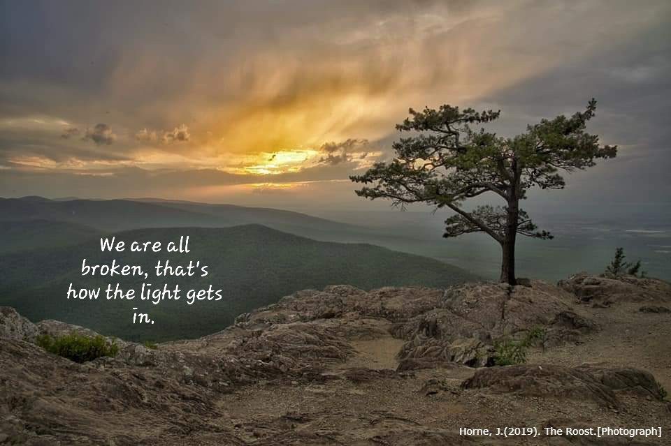
Waterfalls are one of my favorite things in the world. They remind me to just go with the flow, which is a concept I struggle with often.
After exploring the editing sites in the Sandbox, I think I like Pixlr the best. It seems to be the most user-friendly of the options. I would use it in my media center to allow students to edit images for possible backgrounds or to use in presentations.