I have never made an infographic, or honestly, any visual aid besides a power point presentation since high school so this was a very new project for me. Every one of the sandbox sites was new to me and I was a little nervous about how easy they would be to use and unsure of my ability to really create something I was visualizing. The templates on the sites were a huge help to someone who is new to the process. I was able to choose templates based on infographic examples on every site, which helped to visualize the concept of what I was planning to make. I decided to pick something that I was familiar with and made sense in an infographic format without being too long.
I then made several infographics on the sites with the same information so that I could compare the results.
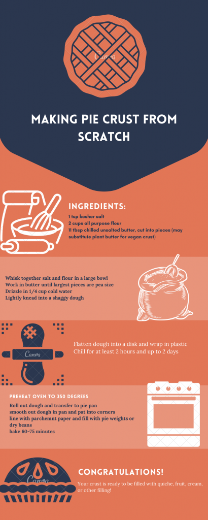
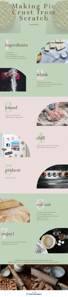
I liked the simplistic graphic options and bold colors on the Canva site and found its template to be fairly easy to use, with a good variety of visual options. I decided to show those infographics here, choosing the two that I think make for a good comparison on how different infographics can be, even with the same information and general format. With a simple change of color and font and use of graphics, it’s neat to see what a different feel you can get, especially when compared with the piktochart infographic. I liked that the piktochart infographic had sizing options that included what you were using it for, like instagram story or facebook post, which could be helpful if someone was making a graphic for something specific.

I think these sites would make for great projects for students and a great way to let them utilize their creativity and have fun while learning about information consolidation, graphics, and using these technologies.
Mary-
I love that you chose to make 3 infographics covering the same material to compare the tools! All 3 look great, but I think my favorite was the one you made using Piktochart. Which did you think was most user-friendly/provided the best result? I agree that they would make great projects for students!
-Gray
I think they were both fairly easy to make. There were a couple of things that I wanted to do with Piktochart that I couldn’t (or at least couldn’t figure out!). One example is the half pies at the top. I wanted to cut the pie out of the background to get rid of that faded square but I didn’t see an option to do that, so I just turned the opacity down a little further than I would have if I could have cut it to lessen the effect of the square.
I also got a little frustrated switching the pictures around. I had originally thought the roll dough instruction would be further down and so I had already placed the picture in the space above and when I went to move it I struggled to move just the picture without moving the shape. I ended up just pulling a second picture and placing it where I wanted it and then replacing it where it was.
I also compromised on what I imagined for some of the photos but that’s to be expected, I think, and was the case with both sites.
Overall, I thought the sites were really helpful and considering that I am not familiar and therefore probably didn’t take full advantage, I think the results are pretty good for free infographics!
I think they are all useable and I like the teal and gray one, except for the handwritten font I chose. I don’t like the way it looks with the other font but didn’t realize how much it clashed at first. Now it bothers me. I think the Piktochart is probably the most user friendly, mostly because it had more areas for me to break down and space out the steps of the recipe better. I think I could have made more on the canva but didn’t really think of it since I automatically had the one page. On piktochart, the information flowed in such a way visually that I didn’t realize that I was making it so long until I had done it.
I really like how you did one with each of the 3 sites to compare! Coincidentally, the first one you used with Canva is the same template I used too. 🙂 I think the 3rd infographic is the most aesthetically pleasing one. Is that the Piktochart one? I think the numbers playing a prominent visual role like that helps to illustrate the step by step process for the viewer in addition to the fact that it uses actual photographs and not symbols/icons. Makes me want to bake a pie now!!
I really appreciate that you created multiple infographics with the same information. It makes for a powerful conversation with students about telling the story with the right images, fonts, and colors.
Yes, after I played with canva, I really liked the fun colors available for the that template and went ahead and made a few for comparison. Then I used piktochart, and after seeing the possibilities that were of such a different feel and style from the one that caught my eye on canva, I really just wanted to try something entirely new. I like the idea that the first two have the same template and a similar general feel and yet look so different. I also like seeing the same information in a completely new way and seeing how that changes the results.
I like you created a similar infographic for the same topic. The visual results are so different. Canva is the graphic platform giving me less frustration. Time, persistence, and practice are the keys to improve the design of infographics to convey a message for the intended audience. Until now, I used online infographics without checking for their copyright (Oops!). It was my first time to create one. After the frustration stage of learning a new tool, I enjoy doing it even if it was time consuming. I plan to use it more as a comprehension assessment in my classes.
I think using the same information in 3 different tools is a great demonstration on how depending on what software you use, the story can be a little different. And it made me want pie!
Using the same information for all 3 infographics was a great idea. I agree that this would help students see the value and differences they all have.
This was really fun. Thanks for sharing and comparing the different tools.
It was a great learning experience for me! I don’t have much experience working with graphics so it helped me a lot to give myself a project and then compare the results.