Infographic for ENG-307
Infographic Project: The Rhetorical Triangle
Christopher R. Blue
English 307T, Professor Virginia Tucker
November 11, 2023
Abstract
This paper will describe the infographic I created and the visual and digital rhetoric used to create it. This paper will also explain the history and use of the Rhetorical Triangle and how it can be used. I created the infographic using a program called Canva and utilized multiple sources, both on Canvas and educational. I will describe the use of my wireframe to create my final infographic.
Infographic Project
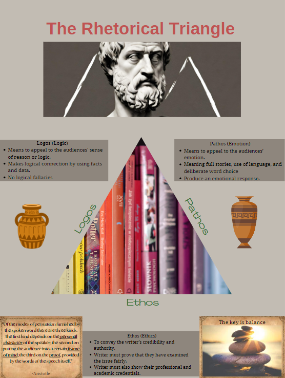
The idea for the subject of my infographic came from my love of history and books. I created my infographic based on the Rhetorical Triangle. The three sides of the Rhetorical Triangle are Ethos, Pathos, and Logos. I used the triangle as the center of the infographic so it would stand out. Then, I used colors that were neutral and not too bright. My use of font size, color, and placement of the parts of my infographic make it pleasing to the eye and not use those colors that are difficult to look at.
The Rhetorical Triangle
The Rhetorical Triangle comes from the writings of Aristotle. Aristotle was born in Greece and was one of the greatest philosophers of his time. “Aristotle taught that a speaker’s ability to persuade an audience is based on how well the speaker appeals to that audience in three different areas: logos, ethos, and pathos.” (Lutz & Henggeler, 2009) This is the whole point of the Infographic. I want to persuade people to read my infographic by means of these three areas.
I used the PowerPoint “WebRhetoric, Authorship, and Digital Writing”, from Week Four to provide the definitions and examples of the Rhetorical Triangle. The word logos is derived from the word Logic or reason. Research, more information, and facts are the key to Logos. It asks the question, “What point am I arguing?” Ethos is the credibility of my infographic. It “relies on reputation or attempts to develop one”. It asks the question, “Where did I get my information, and if credible sources back it up?” Lastly is Pathos, which shows the emotion and values of my infographic. This is what is going to draw my audience to my infographic. It asks the question, “Does it appeal to the emotions of my audience?” All of these come together to create a triangle to help create a text/graphic that has meaning, is credible, and captures the values and beliefs of the audience.
Infographic Elements
My main goal was to make my infographic look and feel like it was a historical document. To utilize both Visual and Digital Rhetoric. I used Sonja K. Foss’s definition of Visual Rhetoric that was used on week 6 ,“ Visual Rhetoric is the term used to describe the study of visual imagery within the discipline of rhetoric.” (Foss) For colors, I stuck with the darker tones to help give a more serious feel and less bright colors. The bright colors I put inside the triangle to draw attention to it. I placed a picture of books in the center to represent what the Rhetorical Triangle is used for and give the infographic an educational look. I decided not to center this at the triangle at the top but draw some attention to the man who came up with this idea, Aristotle. I also wanted to create Harmony and balance. That is why I kept everything symmetrical. Whatever I did on one side, I mirrored it on the other.
I chose to include a quote from Aristotle to give the feeling that he himself was explaining the infographic. The background for my quote looks like old paper from a scroll, used during the 3 and 400s BCE. I also included a picture at the bottom right to give the infographic symmetry and put the same scroll paper as the quote. The picture is of stones stacked on each other to show balance. Each side of the Rhetorical triangle represents a rock and they all come together to create a beautiful piece.
The Wireframe
The wireframe I created is very similar to the final product. I was going to place the words Ethos, Pathos, and Logos inside of a triangle, but when I added it to my infographic, it seemed off, mainly because of the round edges. My final infographic is made up of a lot of sharp lines. That is why I also put the explanations of each side of the triangle in boxes and give it a similar color background as behind the picture of Aristotle. At first, I was going to use a bust of him, but in the end, I decided to use the AI generator in Canva to create a picture with him and some kind of shape and it ended up giving the feel of Mount Olympus in the background. I moved the Title out of the picture so it would stand out more and draw the reader’s attention to the title.
References
Lutz, J., & Henggeler, M. F. (2009, November). The Rhetorical Triangle: Understanding and Using Logos, Ethos, and Pathos. School of Liberal Arts. https://www.lsu.edu/hss/english/files/university_writing_files/item35402.pdf