Choose an infographic you find attractive or well-executed, and analyze it according to our readings on typography.
How does the font chosen for this infographic align with the emotion its meant to instill in its viewers?
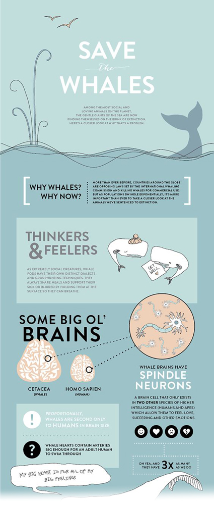
The creator of this infographic on whale biology and conservation has a clear intent to preserve the whale population via informing the public. This is by no means an appeal to the heart; it’s goal is to teach, and its chosen font seems to align with that. This is a modern font, with no flares or serif to distract from the information provided. The creator chose to utilize this singular font for the entirety of the design as well, most likely to communicate consistency and reduce distraction. The handdrawn illustrations beside the text seem to do all the heavylifting regarding emotion (ex. whales with hats and get well cards). This decisionmaking was clear: the text is meant to communicate logos and the illustrations are meant to communicate pathos.