Design Idea File 3
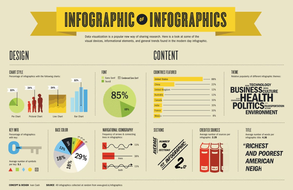
I chose this infographic because it had a good structure and organization. I thought that the showcase of the different types of graphs and charts you can put into an infographic was helpful. For my question I decided to focus on the font. The question I came up with is as follows:
Do you think the fonts used in this infographic work well with the layout?
Answer: I think the font used for the headings in each section is nice and it reads well but the font used for the subheadings, or the body, is too light and put just a little too small to be fully readable. The font in the main title “Infographic of Infographics” is a good one to use as a title font. It grabs the readers of attention and putting the of in the circle adds another layer to the intricacies of the title.