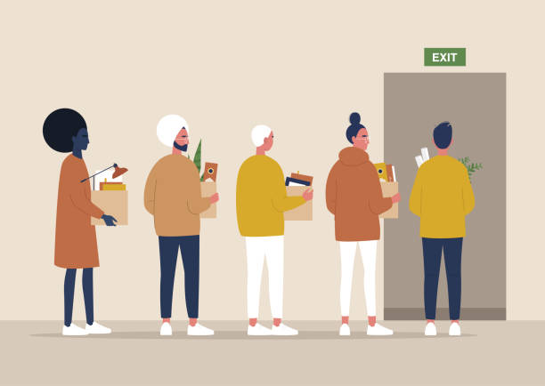
pandemic, employees leaving the workplace” by: Nadia Bormotova
is protected by the Fair Use Clause of the United States copyright laws.
Additional Licensing Details
Standard and Extended licensing options for this stock image are available. However, since this assignment is being used for non-profit educational purposes, usage is permittable under the Fair Use Clause.
Analysis
The hierarchy is established first through the size of the title, which lets the audience know where to start or look first. Thus, the intensity of the font makes it strong and conveys importance which also helps guide the reader’s attention. In addition, the header position is left-aligned, encouraging the audience to start reading from the left and then to the right, driving them into the image’s message. Going from large to medium to small establishes the hierarchy and clarifies it to the audience.
This symmetrical layout aims to provide structure and make it easier for readers to navigate. The dual purpose and intention are to convey a message visually and linguistically. I want readers to be well informed before solidifying a personal opinion and triggering some emotion from their connections or empathy of the situation (as displayed in the image). As a visual communicator, my goal is to lead the viewer’s eye a particular way, and this layout allows just that.
The different categories of information are distinguished through proximity. The choice of hues provides high contrast and guidance to the audience. For instance, the spacing help readers define and determine sections while allowing the content room to breathe. The variety of hues enables the brilliance to pop against the white space, and it does not appear too busy aesthetically. Also, the weight of the header is displayed through the size, style, and intensity of the serif font style.
The left-aligned text gives readers’ eyes a visual direction to follow from left to right. All margins are consistent throughout and will appear organized to the audience. The combination of texts are explicit and flow. For instance, the image is also positioned to the left, compatible with its header. I purposely did not choose to center align the image under the text because I did not want to interfere with the flow of repetition for the audience. I desire readers to know what to expect. Thus, allowing the audience can relax and solely focus on the content.
The intense header emphasizes and demands the audience to ‘start here. Additionally, the bright colors of the visual text easily stand out. The pops of hue give the image more contrast. Thus, it points the reader’s eye to the critical act shown in the image. The photo shows people walking out with their items. These people may have been fired or resigned. I chose imagery that would allow the audience the flexibility to assume either. Moreover, making it personal and relatable to a variety of audiences. It shows people of all races and genders being impacted and walking out, gesturing an act of motion.
All elements are neatly sustained and arranged according to the margins and automated spacing. Thus, allowing for grid reflecting structure, organization, and overall text alignment. Yet, this predesigned image did not require a grid.
The symmetry is evenly balanced throughout, and the weight does not appear uneven. For instance, the active design elements are found only within the positive space of the image. The lighten background of the image allows the saturated hues to counterbalance. Thus, a serif-style text passively allows the negative space to compliment it. Whereas will allow me to reach the expectations from my audience without overwhelming them.
Yes, the imagery’s metaphor contrasts or reinforces the ideas established in the text. For instance, the imagery communicates the story for me (author). In contrast, it conveys that people are leaving and walking out while holding boxes. The exit sign defines a commercial space and displays that people are leaving work. Furthermore, the metaphor of boxes being held by various persons conveys they have packed up their personal belongings.
The aesthetics are appealing as the background tints allow the metaphors to speak. The overall lighting contrast gives the image composition an emotional mood. The intensity of the headers helps point the viewers to where to start and demand dominance. The linguistics serif fonts and size of the caption and body passively allow all texts to serve their purpose.
Editing Images In Gimp
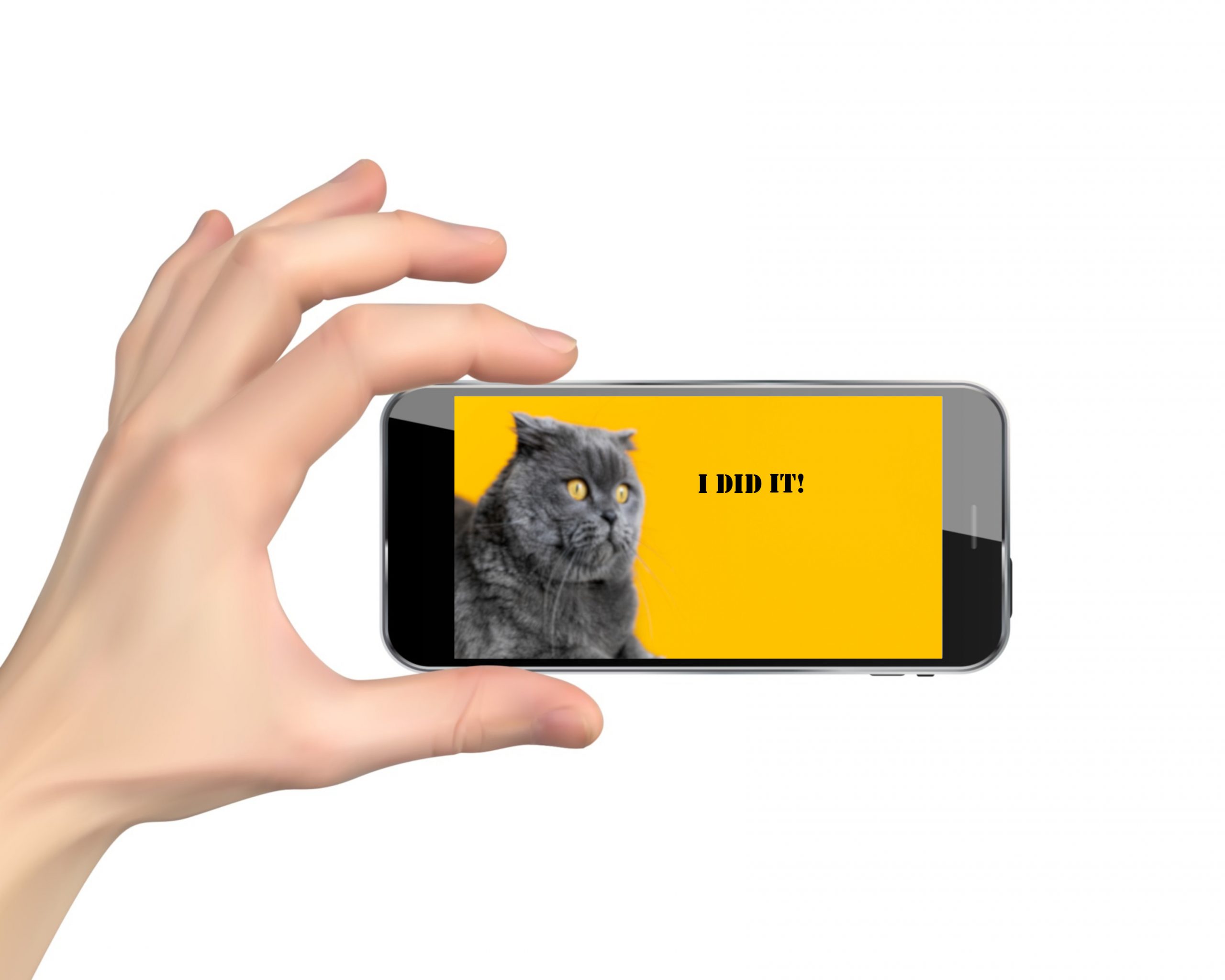
Suggested Enhancements
I appreciate how the hues of the cat image are intensely saturated. However, I would decrease the value of the background chroma to tone down the chroma. In addition, I would further enhance it with more metaphors. For instance, the cat appears to have a look of shock or being startled, but the audience does not know why. I would add a metaphor of a dog barking at the cat or a mouse running. Of course, this is also an excellent opportunity to design it into a funny meme. For example, I could include linguistics within a speech bubble. In short, minor enhancements like these could change the entire mood of this image from a frightened cat to a shady cat.