
According to the Kostelnik readings the idea of document or image arrangement is very important in not only guiding the gaze of the audience but it also helps to create a structure for the document. For this design idea file I wanted to show how manga panels do a great job at their arrangement and how that helps for the manga authors to convey their story message through the arrangement of the panels.
The Kostelnik readings went into great detail about how something as simple as how a document is arranged can have a great effect on the tone or mood of it may be perceived. For the example of manga the main setup of all the pages are the same. The story is read from right to left which is the opposite of how we read here in the U.S.
Even though most manga may be set up in a similar fashion does not mean that all of them present the same type of tone or atmosphere.
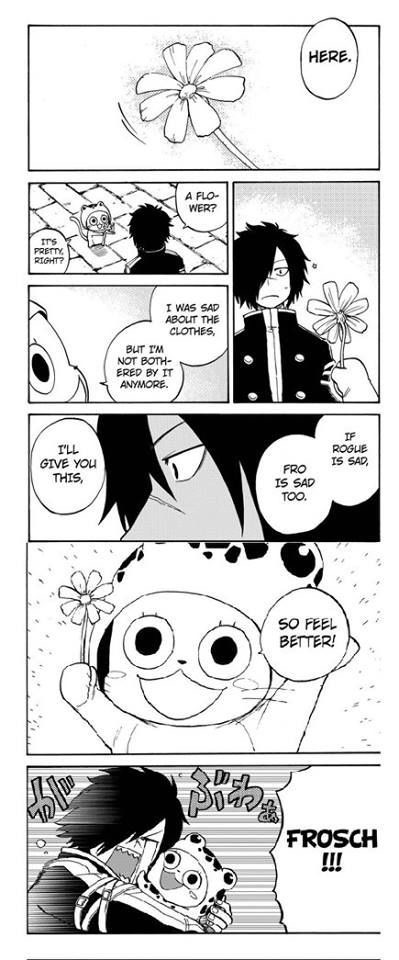
This panel for example is from the manga Fairy Tail. By the appearance of this panel the reader can clearly tell that the author is going for a more lighthearted/ heartwarming feel. The shading in this panel in particular is on the lighter side thus setting a more hopeful mood.
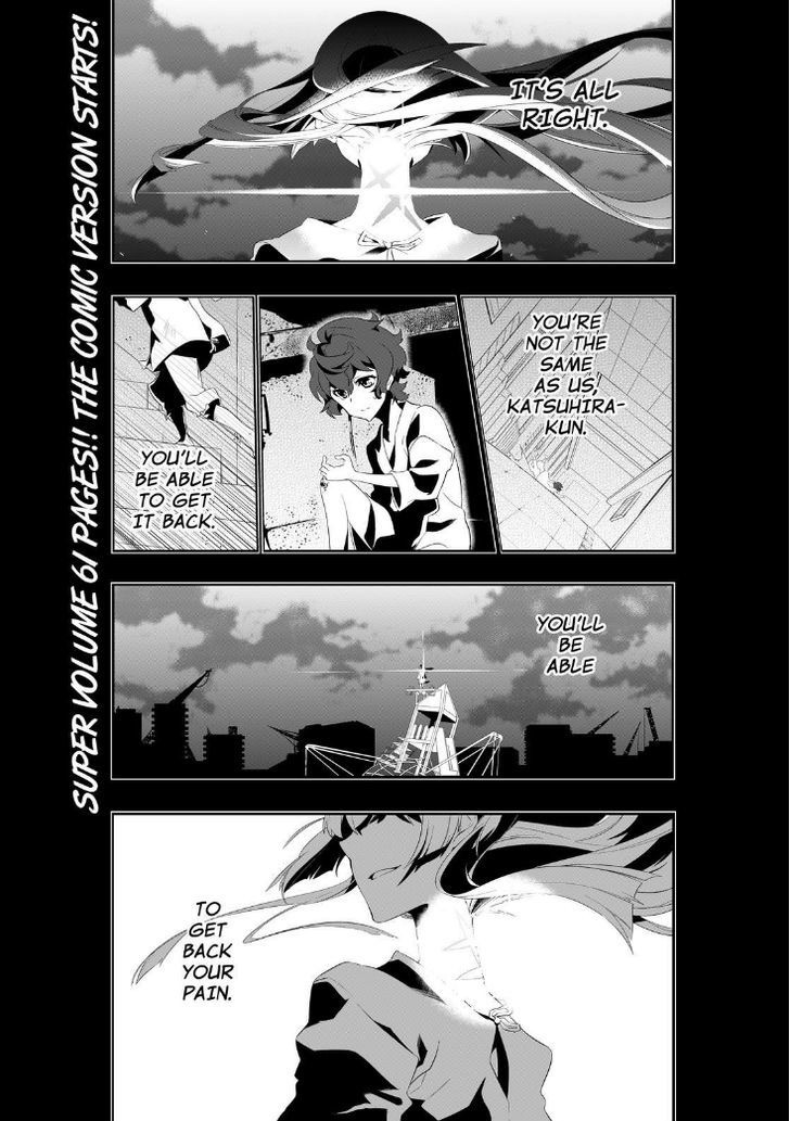
Now this panel is from the manga called Kiznaiver. As the reader you can immediately tell by the darker shading that the author is trying tp set up for a more ominous mood. The way these panels are set up in different sizes and shapes really directs the focus of the reader and is trying to guide them to the more important parts of this sequence.
In the end the Kostelnik readings were very insightful and did a good job explaining the importance of arrangement and setup of different documents. It really is amazing on how much just the shading, layout, and arrangement of a document can really alter the way it may be perceived by the audience.
Leave a Reply