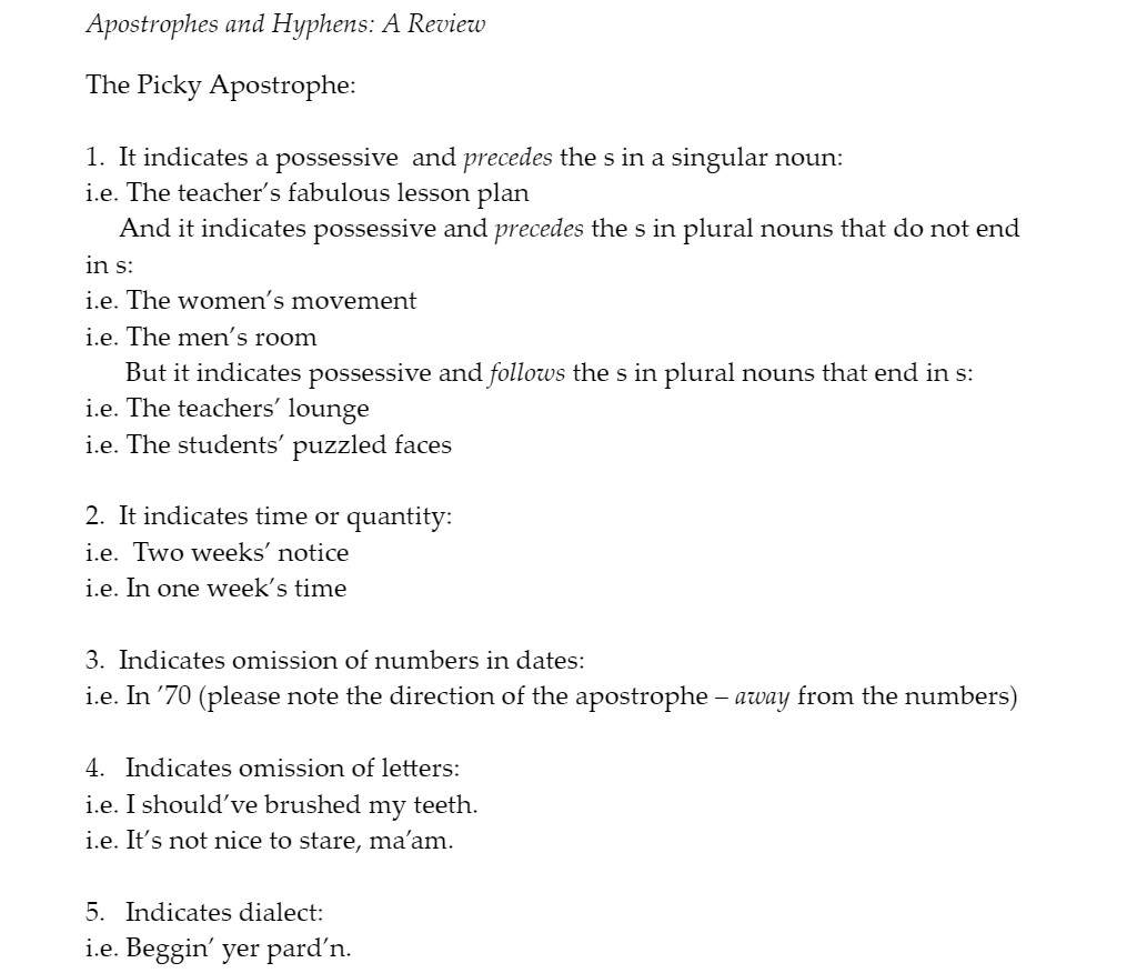
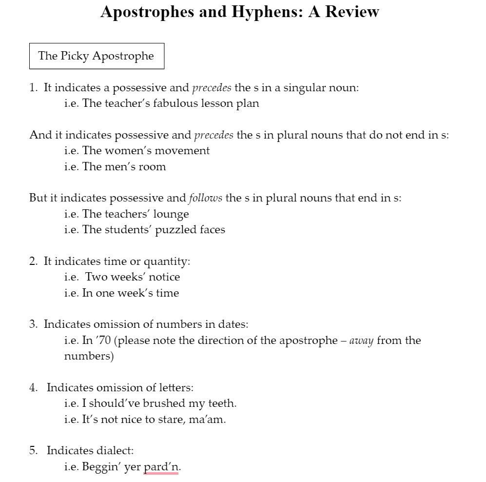
As a means of applying your reading in Eats, Shoots, and Leaves, download and complete the mechanics exercises in this file folder (link). These mechanics exercises are nearly 15 years old and they’re not great examples of document design. What aspects would you revise or redesign to better fit today’s audience and make a more user-friendly and effective instructional document? Aim for about 75 words.
As I completed each of the mechanics exercises, I physically could not stop myself from altering the alignment and spacing of the document’s elements. It was just too difficult to skim the review materials at the start of each exercise and answer each question without modifying the document’s alignment, font size, and negative/blank space. For documents like these to be user-friendly, they must guide the user’s eyes through each element without awkward interruptions, and they must consider what amount of space is appropriate for users to interact with the document, both physically and digitally.
Design Revision


