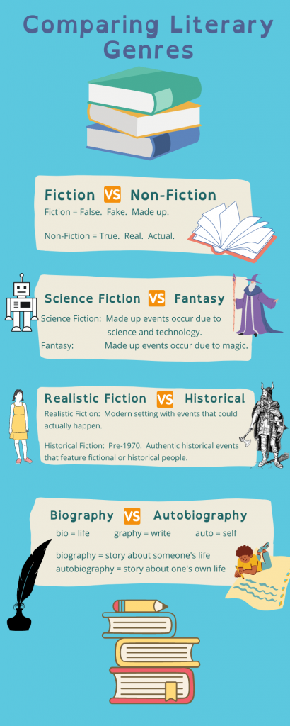
Upon reading the assignment prompt, I immediately thought of literary genres. At the beginning of every school year, I would teach literary genres, as I found that many of my students had a difficult time distinguishing between similar genres such as science fiction and fantasy. I thought that creating an infographic that shows the difference between confused genres would be a helpful aid in a library or English classroom. Since Canva was recommended by prior students, I used it to create the above infographic. I found Canva to be very easy to use, and I appreciate its wide range of graphics, though I was disappointed that the majority are only available through the paid subscription service.
I think that infographics make terrific teaching materials as well as assessment tools. Rather than having students make a poster than reaches a limited audience of a classroom or school, have them show their knowledge with an infographic that can reach millions.
I love this infographic! My students, too, confuse all of the different literary genres. This would be great as a poster in the classroom or the library.
I like your infographic. I particularly like your three word explanation of fiction vs. nonfiction.
This is a nice infographic. Short and sweet and the images added are a bonus! Fiction breakdown is straight to the point: False, Fake, Made up…I mean there is no reason why a student can’t get it!
Thank you! I tried to change the font color for the F in Fiction, False, and Fake to make them all match, but unfortunately Canva doesn’t let you change just one letter in a word.
After last week’s sandbox on images, I stuck my nose up at clipart. Your infographic rekindled my affection for the simplicity and ease of use for both the designer and the audience. The complimentary colors of the blue background and the orange “vs” worked really well too.
Thank you so much! I was so happy to find the orange “vs” that perfectly matched the orange book at the top and complemented the blue background. I got very lucky!
I am very impressed with this end product! You mastered the layering of background, text, and picture elements, which gives it all so much more visual interest. This looks like something you’d find for sale on TPT.
– AnnaLisa
Thank you so much! What a kind comment.
Nice color combinations. Blue is calm and easy on the eye. I also think you did a great job selecting images to represent each genre. One thing that might even make it easier to read is separating the explanations to also be side to side so that they fit the ‘Vs.’ left-to-right scheme that the titles and pictures already present. At any rate, great design!
You’re absolutely right! That would have been a great design choice.