Choose an image you find attractive, well-executed, or related to your academic and professional interests, and analyze it according to the Kostelnik readings: choose a segment of the reading and form it into a question for the purpose of analysis as I did with DD Ch. 1 above.
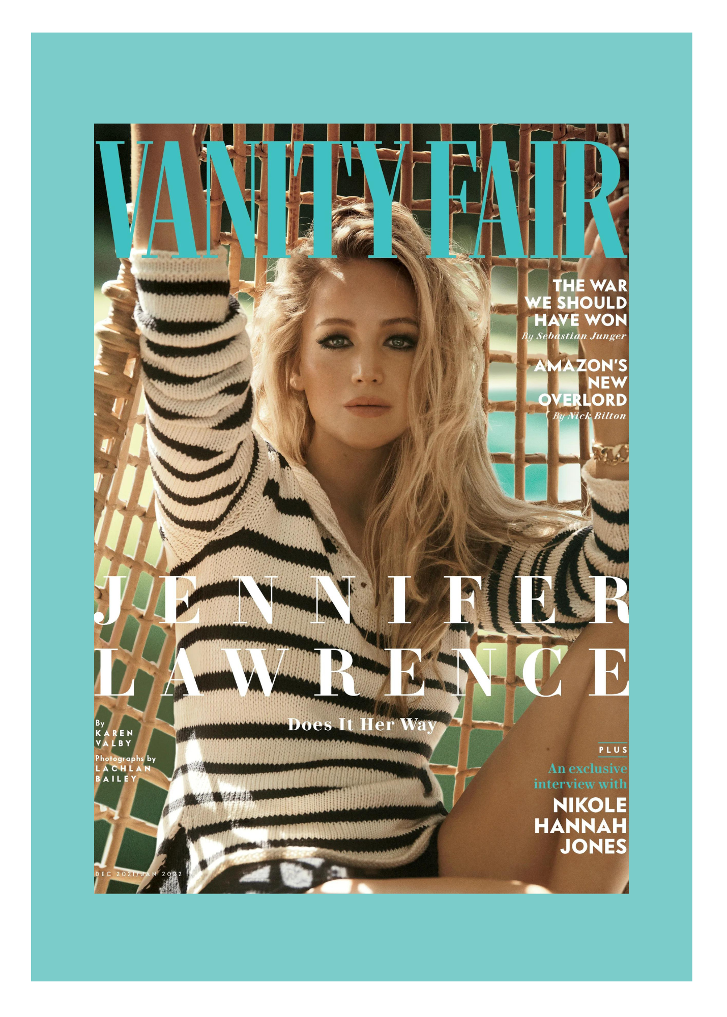
I chose this photo of Jennifer Lawrence from her 2022 Vanity Fair shoot. Ironically, the point of the spotlight on Lawrence is to hear background on why she stepped away from the spotlight. I think the photo is extremely well executed as celebrities these days who spend much of their time in the limelight are usually in flashy, vibrant, and unique outfits when doing photoshoots for Vanity Fair, Rolling Stone, Vogue, etc. Lawrence is in a very laid back and relaxed sweater with her hair undone which is a good depiction of those who even in the midst of fame are still normal people who just want to live normal lives. Aside from the true meaning of the photo, the colors are very aesthetically pleasing to the eye. It gives off very earthy beach vibes. Colors in photos are very important because it is one of the first thing that draws a person in. In Kostelnick’s reading, there is much focus on clarity. When considering clarity I always think of precision. Everything about this photo is precise due to a few key elements. The person the picture is focusing on: Jennifer Lawrence, the magazine company: Vanity Fair, and brief insight on what the portion of Jennifer Lawrence will be based around. Additionally, it also gives a bit of insight about what else a reader can find in the magazine while still making the main focus point about Lawrence. A part I found interesting in the reading was when Kostelnick discusses a “visual field” and what it is and how we see through a visual field. In the photo above, I think the aesthetic is nice because it shows that less is more. In a photo, I think it is important to establish a theme. (Ex: colors; neutrals, pastel, neon, etc.) It is important to avoid distracting the viewer with so much different detail to the point where they lose focus of the main point. I think simply put, why is less more and why does visualizing less draw a reader in more?