Choose an infographic you find attractive or well-executed, and analyze it according to our readings on typography: choose a segment of the reading and form it into a question for the purpose of analysis as I did with DD Ch. 1 above.
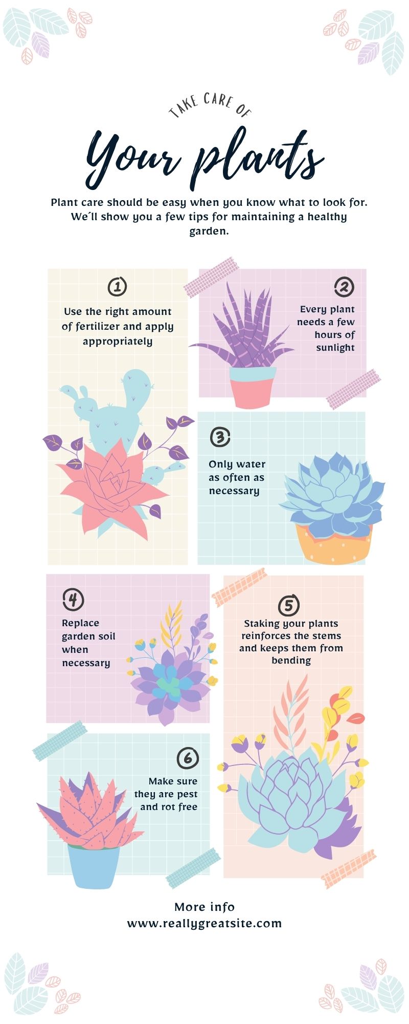
I really enjoy this infographic for many reasons. The goal of this infographic is to give step by step instruction on how to care for plants. As plants and flowers are usually vibrant colors or pastel like, the color choice here was spot on in my opinion. It really drew me in because although there are a lot of different colors present here, nothing about it is overwhelming. The colors are soft, warm, and pastel. I think what makes this infographic really stand out is the font and font color choice. I like the fact that the creator took a dark navy/black twist on the written portion so that it stands out on the background. Light and dark always work really well together because whether it be light on dark or dark on light, everything pops and clear to read and follow. I based my search on infographics off of typegrophy first and then found a color theme that I additionally enjoy. In my opinion, when I think of or hear the words plants or flowers I instantly think of something cute and dainty. The title font “Playlist Script” is exactly that. For example: if the creator chose a bold print chunky font I don’t believe it would fit the aesthetic at all however, since the goal of this infographic has to do with plant care, the title fits perfectly. The additional fonts in “Slopes” and “Mirza Medium” are different but still work because they are small and quaint. As for the reading, it discusses how documents may include different kinds of text as well as the various kinds of textual design objects. The infographic I found does exactly that. There are different text uses to differentiate between different things. On page 170, principle of order seems very important and I believe that is essential when creating an infographic. Because an infographic is usually a step by step process about information, starting from the top and working towards the bottom is important as it discusses in that segment of the reading. I think this infographic does a decent job of doing so especially by adding size contrast. “Why is Typographic contrast so important when creating a flyer and how can it negatively or positively impact the work being created?”