Slidedoc Project
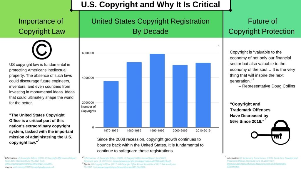
The following concept is my design for the slidedoc project. Throughout this assignment
I referenced to Garr Reynolds’ book, “Presentation zen Design” for inspiration and guidance. By
using Reynolds’ design philosophies I focused primarily on my use of space, typefaces, color,
and story. This slidedoc project shares a narrative centered on the importance of United States
copyright and why it is crucial to U.S. growth.
Taking a step back and looking at the different design decisions I made during this
project, I now realize that the use of empty space was one of my main concerns. Reynolds’
explanation of empty space as a design choice helped to curb my obsession with just filling in
the white, “Designers see empty space not as nothing but as a powerful something. The biggest
mistake most people make is seeing empty space as something that must be filled in — as
something that is wasted unless it is occupied with more elements” (17). By focusing on
Reynolds ideology on empty space I was able to focus on filling space with important
characteristics that helped add to my story.
As my project came to life the desire for color started to take root. Filling in the empty
space with color was the hardest design decision during this project. My struggle between using
monochromatic, analogous, or complementary color schemes in order to create the harmony I
wanted, was more challenging than I originally anticipated. I turned to Reynolds’ ideologies on
color combinations to help make my decision, “[Monochromatic color scheme] is a very
effective way to achieve harmony since using the same hue gives your slides a unified,
professional look” (73). Reynolds’ insight on the monochromatic color scheme provided the
advice I needed in order to keep the balance I desired.
The last design aspect I want to go over is my choice of typeface. Choosing a typeface is
an important design element, so important that Reynolds devotes a whole chapter on the very
topic. Reynolds explains this importance by describing the balance type brings to a project, and
what you choose reflects that overall balance, “When you design with type, the goal is to create
harmonious relationships…the size and location of the type impacts the relationship as well”
(43). Keeping Reynolds advice in mind allowed me to make a decision on a suitable typeface
that was easy to read, a size that fit the slide, but most importantly an overall theme that felt
harmonious to the project.
One suggestion I would give myself before starting my next slidedoc would be to give
myself more space. I believe my focus was too heavily placed on the idea that too much text, too
many pictures, and too much writing was going to make my slidedoc look cluttered. I think if I
would have took the time to properly write down what I wanted to say, I wouldn’t have run into
the problem of over thinking text size, typography and space. I took away a great deal of
knowledge from this project and I look forward to creating something new again soon.
Reynolds, G. (2014). Presentation zen design: a simple visual approach to presenting in today’s
world (2nd ed.). New Riders.


