Infographics are a visual way to present information and data. I visualize myself using infographics in French class to introduce concepts such as steps in verb conjugation or adjective agreement. It is also a way that I can use a visual medium to share class information that is not just a written syllabus. Connor (2017) suggests the reason to use infographics is because “90% of information transmitted to the brain is visual” “and visuals are known to improve learning and retention by 400%” (Connor, para. 5).
If I were to have my students create infographics in class, I would start by having them research or storyboard a topic. This will allow them to chunk their content into bite size pieces. In my case, the county where I teach provides students with access to Adobe Spark. In Adobe Spark, you can search for “infographic” and you get a large selection of infographic templates. I would have the students browse the different templates to imagine the different ways they can present their content. In Adobe Spark, it is easy for students to select a template and use it as the basis for their project. I can also see myself having students create a visual family tree introducing the different members of their family (in French, of course).
Below are my experiences with a few different infographics creators.
Canva Infographic (https://www.canva.com/create/infographics/ )
Canva has a large selection of templates in seven different categories including business, social media, and education. It was very easy to use. To change graphic images, you simply click the elements button on the left hand menu and then search for the graphic you are seeking. It is easy to add and move shapes with the option of bringing them forward or sending them back behind text. Adding text was as simple as clicking the text button. Once you have your text you can shape the text box and change the font, color, and style at the top of the page. From the File menu it was easy to download the infographic. Canva also saves your work as a project.
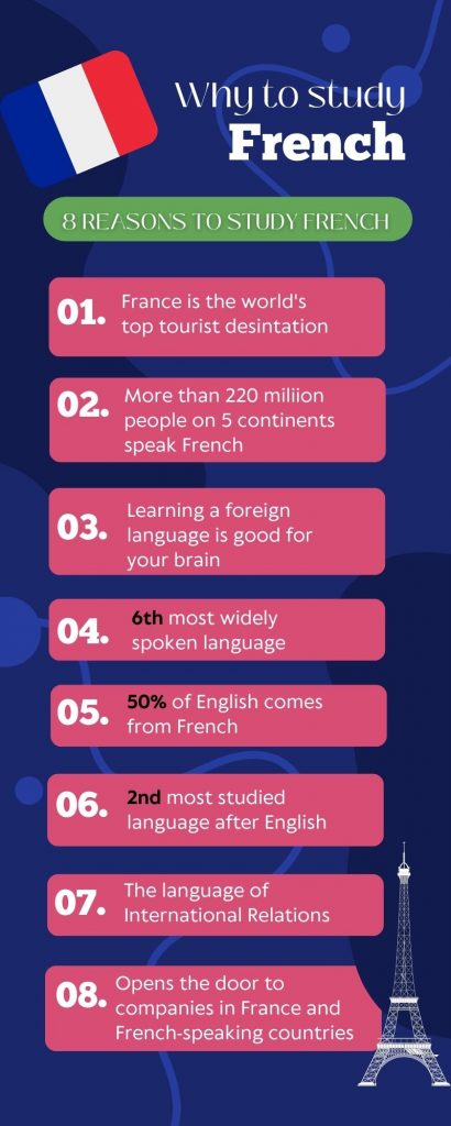
Below is an example of the infographic I made in Canva. (NOTE: if you are an educator you can upgrade to an educator account.) Of special interest, there is a large variety of resume templates that are well designed and engaging – it may be a great tool to create that librarian resume! The content from the infographic below is from an infographic by J. Schipp (2018).
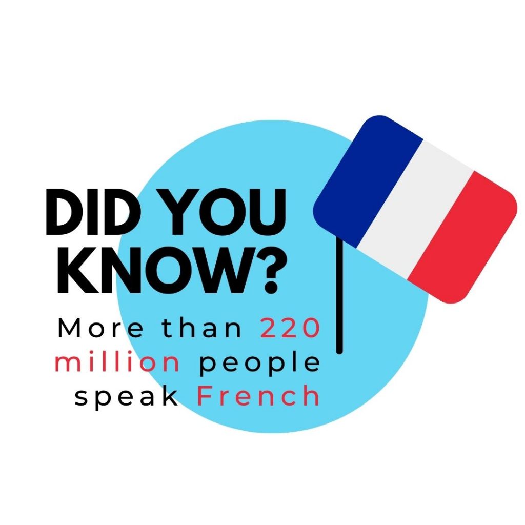
I also used a Canva social media template to make this instagram infographic.
Piktochart (https://piktochart.com/)
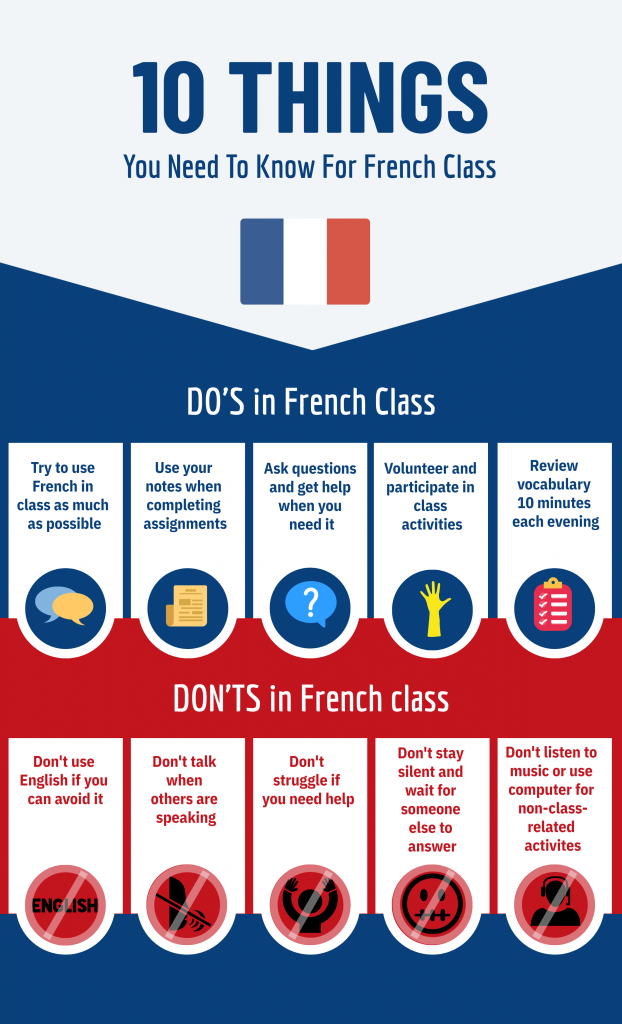
Piktochart gives you templates in 7 different types of documents like infographics, posters and flyers. There is a wide variety of infographics templates. Simply click on one and then you can modify it. There is a tools menu on the left where you can add or change graphics, add design components, change a background, add text, change a color scheme and additional more advanced tools. To change the text, simply click on it and make changes from a menu at the top of the page. You need to upgrade to pro to save your projects. It was easy to download my infographic using the download button. You are allowed only two downloads before you have to upgrade to pro. For that reason, canva is a better choice if you want to save your work and have unlimited downloads. Here is the pictographic I created with Piktochart. I thought I might make a poster and put it on my bulletin board.
Easelly (https://www.easel.ly/ )
Lastly, I tried Easelly. This site had only 7 templates you could use unless you upgrade to pro. Once you select a template there is a menu on the left limited to Graphics, Text, and Background. It is easy to add and modify text but there is a limited number of icons, photos and animations unless you upgrade. When I tried to change backgrounds it changed the border but not the actual background. Lastly, you have the option of uploading an image. However, once I uploaded it, I could not find it!
References
Connor, C. (2017). The Data Is In: Infographics Are Growing and Thriving in 2017 (and Beyond). Forbes.com. https://www.forbes.com/sites/cherylsnappconner/2017/10/19/the-data-is-in-infographics-are-growing-and-thriving-in-2017-and-beyond/?sh=3bbf8248137c
Schipp, J. (2018). Infographic: Benefits of Studying French. [graphic image]. Behance.net. https://www.behance.net/gallery/62518545/Infographic-Benefits-of-Studying-French.
Thanks for the info on Adobe Sparks! Good to have another website to go to for projects. Love all the French ideas and examples! 🙂
I also didn’t know about Adobe Sparks, thanks for the info! I thought your idea of using an infographic to create a family tree was a fun way to learn about one another while also sticking to the language portion.
Great infographics! I found your information on various sites very helpful. It sounds like I don’t want to try Easelly though…it sounds quite frustrating.
Great infographics! I learned something new today. I love how you incorporated the colors of the French flag into your infographic.
The infographics and breakdown of each program you used to create them are well done. I haven’t used Adobe Spark in years so I’m curious to know what kinds of improvements they’ve made.
I did want to share that my B.S. hackles went up when you shared the Forbes article study. I’m just skeptical of it because the study was done by a visual marketing company and only 1100 participants were included in it. Do we really get 90% of information to the brain visually? What about blind people? Are they only receiving 10% of the information as the rest of us? Either way, we should always try to make our teaching materials as accessible as possible.
Thanks for pointing that out. I wish I had caught that ! I probably need to look harder at my search results. Maybe I should research the veracity of that article. That’s a good example of why peer reviewed articles exist.
I have to admit that I didn’t get too far in Piktochart – but your image makes me want to go back to it! I love the Dos and Don’t chart you created . I might have to make one of my own for the fall. Did you select from some clipart that was already in place or have to find your own? They match so well!