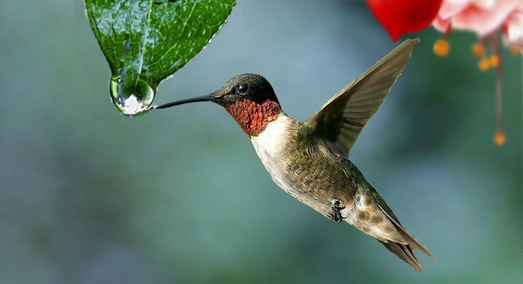
This week’s Sandbox offered many fascinating features. I enjoyed searching the photo sites. I was interested to see photos duplicated on the various sites. In terms of the editing tools I particularly enjoyed Big Huge Labs. I spent the most amount of time there. I tried to create a magazine cover using the hummingbird photo above. I enjoyed creating my own article names and playing with the color tools. I turned to the website Kuler referenced in our reading this week (Reynolds 2014) to create a color palette from the bird’s plumage. It quickly and easily created a harmonious and engaging color scheme. However, I couldn’t get the image sized and centered correctly. I intend to go back and try again. I loved that it allowed me to create new images as well as prompting my creative writing skills. I envisioned using it as a research project. Students could create an image of their topic and use the lines to highlight key facts. I did think Big Huge Labs had an excessive number of ads. At one point I had four different ads competing for my attention at the same time. I had to close them all to focus on my work. That is something that I would have to strongly consider before using it with students.
I also enjoyed exploring Tuxpi and Pixlr. Tuxpi had unique ways to manipulate photo edges. The Pencil Sketch and Ghostify features were particularly intriguing. Due to its simplicity it would be an ideal tool for working with younger students. I imagined using it to discuss their summer vacation or to introduce a pet. Pixlr had more options including detailed settings for color, light, and scene. I really enjoyed the vignette option. There were so many choices I felt like I had fallen down a rabbit hole. It would be an appealing tool for secondary students. They could use it for book reports or history projects.
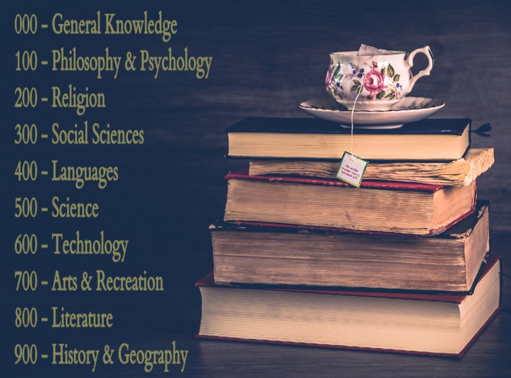
I created and abandoned a lot of projects this week. In the end the image below was created using Pizap. I used it to create a library sign. Pizap had more features and options than Tuxpi but less than Pixlr. I appreciated the reset option that allowed me to easily undo undesired effects. I relied heavily on the visual elements Reynolds (2014) discussed. Including increasing the contrast to make the background darker, employing a sans serif font since it would be viewed on a computer screen, and adjusting the text box to allow vertical space between the lines. Additionally, I turned again to Kuler for my color palette. Initially I pulled red from the book cover. It was too intense and frankly difficult to read. Instead, I chose green from the leaves on the teacup. It offered the sense of balance and tranquility I sought.
References
Iva (November 30, 2015). Water-drop-plant-hummingbird-nature-flowers [photograph]. Pixabay. Retrieved from https://pixabay.com/photos/water-drop-plant-hummingbird-1068029/. CC Zero
Koppens, Y. (January 19, 2018) Literature-library-knowledge-education-vintage-old [photograph]. Pixabay. Retrieved from https://pixabay.com/photos/literature-library-knowledge-3091212/. CC Zero
Reynolds, G. (2014) Presentation zen design (2nd ed.). New Riders/Pearson.
I like how you made something you can use in the library. I think the green was a good choice for the font color because the effect is very soothing as you said. That’s a cool feature to be able to pull a color out of the image. Nice job.
Making a library sign was such a good idea. The color of the font makes the sign appear very calming.
I used Tuxbi and Pixlr also this week. I found Tuxbi a little more user friendly and easier to explore. The library sign looks great!
I like that you said that you created and abandoned many projects this week. Me too! So much to explore, so many choices to make. It took a while to narrow it down to something that felt like it clicked. Thanks for sharing your perseverance!