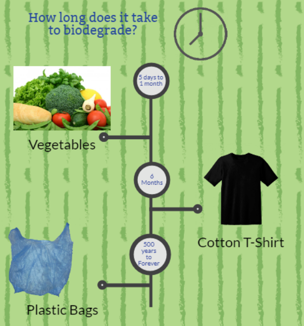
The first tool I used was Easel.ly. I thought it was basic and was a little frustrated that there was not much available as far as backgrounds and graphics without needing to upgrade. I ended up using a template and adding in images I found on Pixabay.com instead of using their limited graphics. I was frustrated with the templates as it wasn’t lining up with the page. I was also able to put text/images outside of the printing area so my whole infographic was off. I am not sure why I ended up being so off but I am also not sure why Easel.ly lets users go outside of the print area anyway. After looking at the other two tools I thought perhaps I just didn’t give this one a fair shot. It was the first time I’ve ever used a tool to create an infographic. So I went back to the site, but again, I found the same formatting and lack of access to graphics to be frustrating.
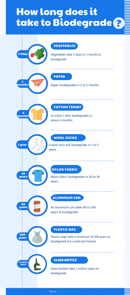
I can see why so many people love Canva. I have never even heard of it, but I am looking forward to exploring it more. I particularly liked that you pick color and font themes. I liked clicking through those and looking at what my infographic would look like in the different combos. I found this tool to be user friendly and I liked the little tutorial it did when I first opened my infographic. I played with the animation a little and adding video. I really liked how there was pre-selected videos you could search by category right there and you didn’t necessarily have to find a video to add. I found the templates to be plentiful and easy to format. I did not like that there were many things that were only available to use with the upgraded membership. Especially when looking to add audio, I found that I had to search further to find audio that I could use with the free membership. I found it a tad overwhelming that there was so much you could do in the tool. I think as I become more familiar this would not be a negative but on the first go, it was a bit of a challenge.
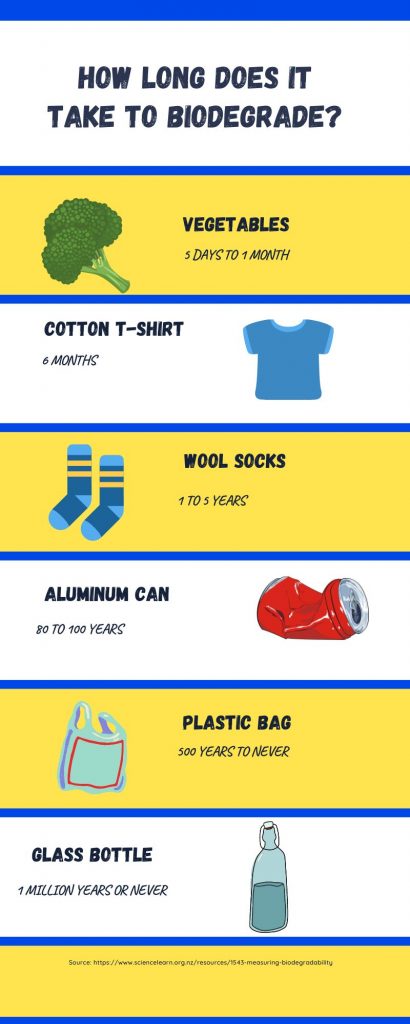
My favorite tool for this sandbox was Piktochart. I really loved that you could access all the digital images/templates etc. without being asked to upgrade. Maybe I was just lucky and in my limited searches never found an invite to upgrade. I did see at the end, that you only have a certain number of downloads until you need to buy the membership though. That is tricky! I found this tool to be very easy to use, format and was not overwhelmed. Like in Canva, I liked that you could pick color schemes and see the effect right away in your infographic.
I think that if I were to use these tools in a classroom or library, I would want to approach it much as it has been framed to us in the class. Perfection is not what we are seeking. It is a tool to learn, all attempts are valuable, and there is no “wrong”. Normally, my attempt at my infographic on Easel.ly would be something I would not share with peers, but I felt comfortable do that here because of how the assignment was put out as an exercise in trial and error. I would want to convey the same thing to my students. I think we often don’t give kids a chance to be messy or incomplete in their work. I think an assignment when messy or incomplete is the bar of success would be a liberating and important lesson to give students (myself included).
My public library had a series of sessions that were for people to come and explore different tools such as the ones we have been using. Each session has a different theme, much like our modules. I think that these tools for infographics would be a great idea for a session to add to that series. I also think that using these infographics on the TV monitors at the library would be effective especially with the use of animation. The monitors as my library, are static and scroll through the different programs or events. My eye is rarely drawn to those monitors when I am in the library. Maybe some animation would help that to happen.
As far as using this in the classroom, I do think that Canva looks like something that offers many options for students. I like the idea of teaching students how to use this tool for many different projects. I think any secondary student could learn Canva and even late elementary. Having students use Piktochart for a final or one time project would be effective as well. The high quality of the options in that tool would make it work well with a project. Having access to all the graphics/templates would also be good for the first time or younger learners as they won’t be trying to use things that they don’t have access too. I imagine teaching a group of 20 plus elementary school kids how to use the other tools, you’d be doing a lot of troubleshooting when they are clicking on things that lead them to the page that tries to sign them up for a membership!
References
Burroughs, J. (December 9, 2016). Black tshirt male fashion top clothes man wear [Digital Image]. Pixabay https://pixabay.com/photos/blank-tshirt-male-fashion-top-1886001/ . CC Zero
Jan. (June 26, 2017). Flat design symbol icon www internet gui surface [Digital Image]. Pixabay https://pixabay.com/vectors/flat-design-symbol-icon-www-2442462/ . CC Zero
Owen-Whal, R. (March 8, 2016). Vegetables produce healthy broccoli diet fresh [Digital Image]. Pixabay https://pixabay.com/photos/vegetables-produce-healthy-broccoli-1238252/ . CC Zero
Re, J. (August 20, 2020). Plastic bag garbage pollution [Digital Image]. Pixabay https://pixabay.com/illustrations/plastic-bag-bag-plastic-garbage-5500675/ . CC Zero
Science Learning Hub. (2021, July 9). Measuring Biodegradability. Sciencelearn. https://www.sciencelearn.org.nz/resources/1543-measuring-biodegradability
I liked your Piktochart infographic the best. I opted not to try that one because of the cookies and need to create an account, but I have seen several projects that make me rethink that decision now. Well done.
Thank you. It was my favorite one too. I used a template and it was super easy.
I loved piktochart too! My favorite part about piktochart was all of the icons and graphics available to choose from!
Very informative post in the fact that you created an infographic in all 3 websites we were suggested to try, I’m sure that took a lot of time and effort to design in all 3.
Great job!
Thanks Laura. I was really into the tools this week. It was a lot of fun!