I created this infographic in Canva. After exploring all three tools, I liked Canva and Piktochart best. I didn’t like that the templates in Easel.ly were all lumped together, and I had to search through all of them to get the one I wanted. Also, the choice of photos I liked were smaller in Easel.ly than in Canva and Piktochart. I ended up making the same topic infographic in Canva and Piktochart.
I first made an Infographic in Piktochart. I found it fairly easy to make and find the photos I wanted. The most negative thing about Piktochart is only two free downloads are allowed. Worried I may need more, I choose to make my infographic for the Sandbox in Canva.
Canva was easy to use and offered a lot of choices. I liked that the templates were in categories which made it easier to find the one I wanted. One thing that aggravated me was every time I found a photo I wanted, it was a Pro one that required me to pay. It took a while to find a free one I was satisfied with. I really liked that I could pull colors from the photos to use in my design.
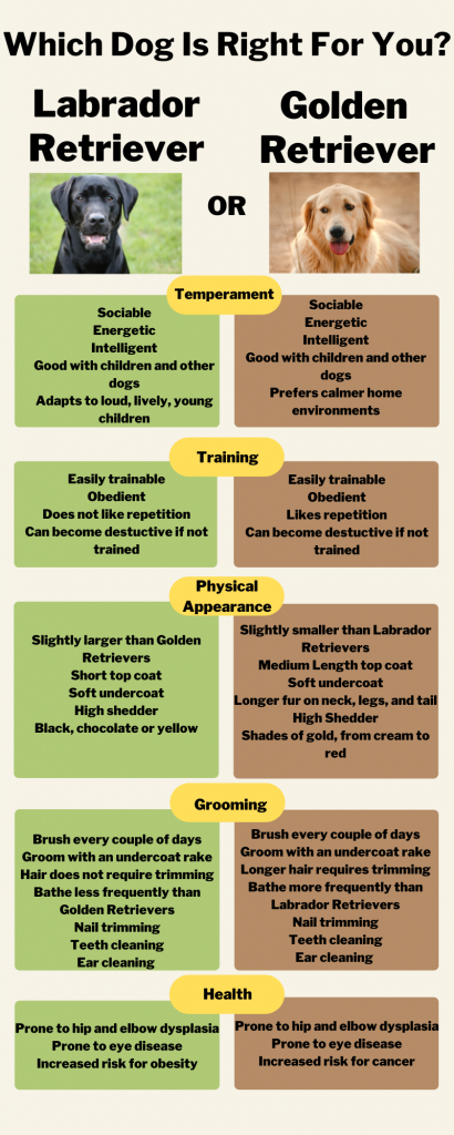
I chose to use the Retriever topic because I love Labs and used to have a black one. Also, my son is thinking about getting either a Lab or a Golden. I thought this would help him. Since Labs and Goldens are very popular dogs, this may be of interest to many people.
When I was determining which typeface to use, I knew I wanted a san serif font. According to Reynolds (2014), san serif fonts are better for computer screens (p. 40). Canva didn’t offer any of the fonts that were recommended in the text. However, Libre Franklin, an expansion of Franklin Gothic (Cherry et al., n.d.), was available. Because Franklin Gothic was one of the recommendations, but not available, I chose to use Libre Franklin. Libre Franklin is a type family and offered five different fonts. I used two different weights within this family. I used Libre Franklin Black for the names of the dogs and Libre Franklin Bold for the rest. I wanted to have some distinction between the title and the dog names and wanted the dog names to stand out. I only used the one typeface since Reynolds (2014) says one or two is generally the correct number to use in a design (p. 43). Also, since the two different weights of the Libre Franklin font “created hierarchy naturally” (Reynolds, 2014, p. 43), I didn’t feel the design needed more.
I experimented with a few different color combinations and had a hard time deciding which to use. For this final draft, I decided to pull colors from the photos for the boxes. The two colors I pulled out are also analogous since they are next to each other on the color wheel (Reynolds, 2014, p. 74). Although the green and yellow are hues and the light brown is a shade, I think they still work well together. I also liked that the color green is natural, balance, and harmony and brown is natural, reliable, and strong (Reynolds, 2014, pp. 79-80). These are characteristics that I feel both breeds of dogs embody. I used yellow, a warm color, for the ovals since it pops and makes it easy to read what each section is about.
I did not add any extra graphics because Reynolds (2014) emphasizes that simplicity is a rule that should be followed when presenting data (p. 152). I think the two photos of the dogs are effective and are all that are needed. I wanted to leave white space to help the reader focus on what is important (Reynolds, 2014, p. 161). I did warm the background slightly by changing it from white to a very light cream color.
I enjoyed creating the infographics and exploring each tool. I feel this would be too difficult for younger elementary students to do individually. With guidance, perhaps fourth and fifth graders could be successful making individual infographics. For younger students, making a class infographic together with the teacher or librarian would be a good project. There are so many topics for which these could be used. In the library, character development could be shown in an infographic. In the classroom, the writing process, events in history, and research projects are just some of the ways infographics could be utilized.
References
Cherry, D., Garrison, J., & Blackwell, E. (n.d.). Complete guide to Libre Franklin. Beautiful Web Type. https://beautifulwebtype.com//libre-franklin.
Gibeault, S. (2022, February 14). Golden Retrievers vs. Labrador retrievers: Similarities & differences. American Kennel Club. https://www.akc.org/expert-advice/dog-breeds/golden-retriever-versus-labrador-retriever-do-you-know-the-difference.
Hertz, L. (2022, May 31). Golden Retriever vs Labrador breed traits and personality. thelabradorsite. https://www.thelabradorsite.com/golden-retriever-vs-labrador.
Reynolds, G. (2014). Presentation zen design (2nd ed.). New Readers/Pearson.
Nice post. I really assumed they were basically the same dog but it was very neat to learn how the two differ. I have a yellow lab and can definitely agree with the labs being happy around an energetic household mine is going to be 5 in November and is still a huge ball of energy.