Introduction
In preparing to create my poster, I sought a subject that I felt would be able to grab a viewer’s interest. “Crap detection” was one of the subjects from our class readings that certainly grabbed my interest. The title of “Crap Detection” and much of the information on the actual poster came from the book “Net Smart”, which has a chapter titled “Crap Detection 101”, which sparked the idea that I could evoke the imagery of “crap” in an infographic or poster (Rheingold, 2014). I also found it to be a suitable subject because I felt I would be able to explain it without having to use long, overly wordy descriptions. The poster made use of several elements of rhetorical design to convey the message in a clear and concise manner. The elements that were used in the creation of the poster which will be described further are shapes, colors, structure, font, and hybridity. While there are certainly other elements at play that I will not expound upon, each of these plays a key role in catching and keeping the viewers’ attention, conveying deeper meaning, remaining clear and concise.
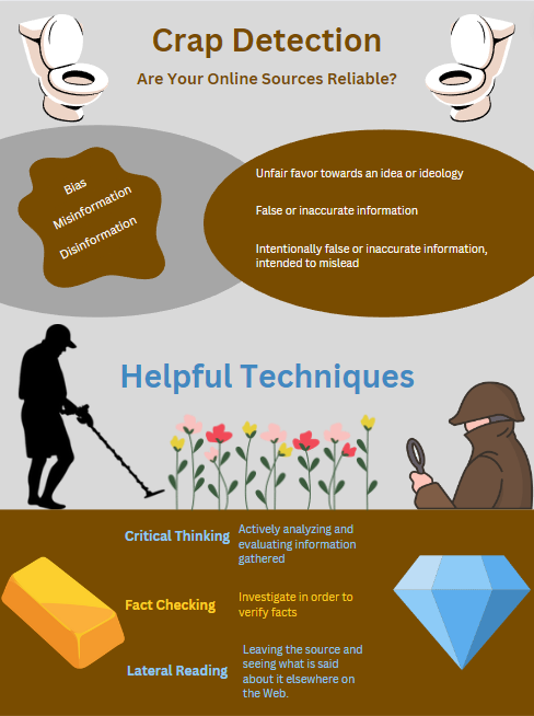
Shapes
I used recognizable shapes to evoke a connection between the reader and content. Working from top to bottom, I first knew that if I was going to be using the title “Crap Detection”, that the toilet would be a key feature in the poster. The linking of the title and words right below it with such a recognizable symbol conveys that the concepts being presented are negative and should be viewed as such (Tucker, 2023). I used a splotch of brown to present the concepts of bias, misinformation, and disinformation. The splotch is an organic or natural shape that is intended to be more pleasing or comforting, but because I made it the horrible brown color, I believe that it only brings more attention to itself. I inlaid the terms and their definitions on solid-colored ovals in order to provide emphasis and help them to stand out, rather than be easily glossed over (Tucker, 2023).
In the bottom half of the poster, after using a second heading, I used three images. The silhouette of a man using a metal detector, making him a metal detectorist, and a detective with a magnifying glass symbolize much the same idea. The detectorist is searching for something valuable in all of the muck that was introduced in the top half of the poster; the detective is trying to use his detective techniques to make sense of all of the muck. What they are both searching for is set just below them in the very recognizable forms of a gold bar and diamond. The images of the gold and diamond are used to express value, which I connect to the introduced “Helpful Techniques” by placing the concepts between the gold and diamond and setting the font to be a similar color. Because the metal detectorist is the leftmost and highest positioned image on the bottom of the poster, his use of the metal detector pulls the viewers’ attention down in the direction that he is looking (Tucker, 2023).
The final shape or image that I used on the poster is between the metal detectorist and the detective, which is a small patch of flowers. Their meaning could have several interpretations, none of which are wrong. First, they are used to add some color and beauty to the poster; without them the poster would be even more drab than it already is. Secondly, they could symbolize something more positive, similar to the diamond and gold bar below it, which the detective is looking directly at. I believe the third meaning is much more thought provoking. The flowers represent a beauty on top of all of the muck introduced above it, perhaps in an attempt to mask it. The reader is represented by the detectorist, not at all concerned with the attractive image presented by the flowers, but instead caring only about what is deep below, like the truth about the message that a source is trying to convey.
The shapes are placed in a symmetrical way to provide the poster with balance between the left and the right. There are more images towards the bottom of the poster, which are used to attract the viewers’ attention there, where the more important takeaways are (Tucker, 2023).
Colors
I made a very conscious effort to choose the very drab look of gray and brown, especially on the upper half of the poster. I already alluded to the brown being “horrible” but just to be entirely clear, the brown is used to symbolize feces, linking the concepts of bias, misinformation, and disinformation with feces. I made sure to use a different color when I was writing the bottom half’s heading, which ended up being blue based on my preference and my feeling that blue is a cleaner, more pure color.
I used the colors blue and gold for the font in the bottom half of the poster to link the terms and their descriptions with the images beside them of a gold bar and diamond. I chose to alternate between blue then gold and back to blue because I knew I wanted to really emphasize that I was linking the images with the words, which I felt that using just gold or just blue did not have the same impact as alternating them.
Structure
One of the key components to making an effective infographic is deciding on an effective arrangement of the text on the page (Tucker, 2023). I used a heading at the top to introduce the overall subject, but also as a way to grab the viewers’ attention, then used the subheading to explain what the attention grabber title was actually talking about. The structural component that I employed when it came to the headings was to add a heading halfway down the poster. This is used to break the text into visual elements (Tucker, 2023).
An additional component to the structure is the pattern that I used, which was to introduce the concept or term on the left side, then explain what it means on the right. I used this pattern in both the top and bottom to establish order and balance (Hocks, 2003). This structure not only clarifies the relationship between the term and the description, but also clarifies that the top set of terms is its own set, differentiating it from that of the bottom. Each set carries its own meaning.
Font
When it came to choosing the font, I wanted it to be a very clear, straight to the point kind of font. I used the “Century Gothic” font for the headings and subheadings as it was suggested as a sans serif font to work well for display type such as headings (Ramage et al., 2016). For the text, to include the terms and descriptions, I attempted to use the suggested “Courier New” font, but I found that it made the words too hard to read and stuck with the “Canva Sans” font, as it seemed to be the most clear and simple font (Ramage et al., 2016).
Finally, for the font colors, I already discussed the symbolism behind the blue and gold colors, but one of the underlying requirements when searching for font color that carried meaning was that it had to be a light color. The light colors against the dark brown background help the letters stand out and remain clear.
Hybridity
I attempted to utilize “hybridity”, as described by Hocks, to convey the information on the poster. I could have made this poster into a short essay that describes the pitfalls of information found online; it would have been more informative and more specific, but very few people would take the time to read it (2003). The poster that I made is much more accessible and quicker to demonstrate the information by combining the verbal information with visuals in order to develop an understanding. A thirty-second glance at the poster provides the viewer with the most important elements of information in an eye-catching and interesting way.
Conclusion
In an effort to convey my message about understanding the pitfalls of information online and how to combat them, I have attempted to employ several elements of rhetorical design. The main elements highlighted in this essay are shapes, color, structure, font, and hybridity. While there are more elements at play than I understand, I have attempted to utilize the techniques and concepts that I have learned in class in order to convey the information in a clear, concise, and attention grabbing way.
References
Hocks, M. E. (2003). Understanding visual rhetoric in digital writing environments. College Composition and Communication, 54(4), 629. https://doi.org/10.2307/3594188
Ramage, J. D., Bean, J. C., & Johnson, J. (2016). 0009 . In Writing arguments: A rhetoric with readings (pp. 165–196). essay, Pearson.
Rheingold, H. (2014). Net smart: How to thrive online. MIT Press.
Tucker, V. (2023). Visual Rhetoric in Digital Artifacts [PowerPoint slides]. Canvas@ODU. https://canvas.odu.edu