
Infographics
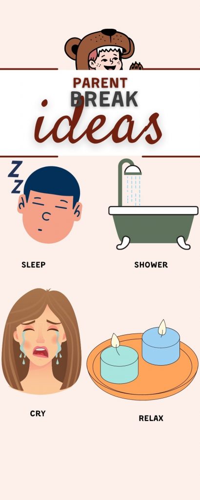
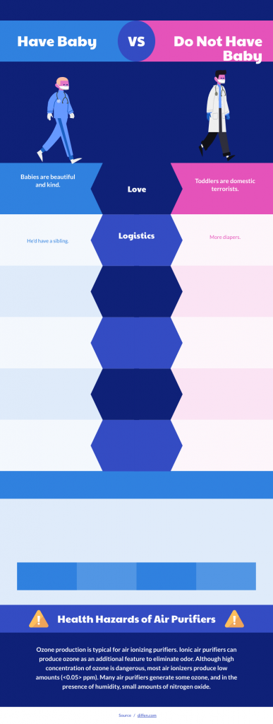
The above infographic is from canva. This was honestly an easy week for me. I love infographics. I think there are so many ways to pull off an infographic but I always pay careful attention to the color scheme and size of the font. I think the colors need to be complimentary and the headers clear. The one below I made on pikochart. I do not like any system I’ve tried yet more than Canva. I actually have a subscription. I do like the warm and cold colors that I was able to utilize in the second infographic.
3 Comments
I loved Canva too. This was my first time using these tools and I found them amazing. They are so user friendly and the possibilities are endless for what you can create.
I too enjoy using Canva, it’s super easy to let your creative side go free. I really enjoyed the colors of your template and I can see where the idea of cool vs warm can be useful when keeping the palette balanced.
I really like your first infographic. It is very simple but gets the message across. Your use of images really helps to make the information easy to consume.