Infographics are fun to view, but I never realized how much work goes into making a thoughtful and well laid out visual for a presentation or class. Reynolds talks about a good presenter “must point to what is important” in a presentation (p. 153). It is not always obvious to the audience, so “highlight the part you want people to focus on” when preparing and presenting data and visuals (Reynolds, 2014, p. 153). This is an important reminder as we create visuals to share with our students and colleagues.
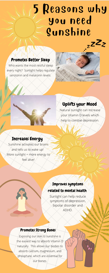
I played around for quite a while in Canva and really enjoyed it. It felt very user friendly and offered a lot of options for templates and graphics. The template I chose helped me to think about the layout I wanted to focus on for the topic I had chosen. As summer approaches, my need for sunlight is very real, so I thought I would research the benefits of sunlight. I picked the top five that I felt were most important to me as my layout had space for five.
I thought of the various elements Reynolds spoke on in the text, including keeping the font consistent and the layout simple. I would definitely emphasize these points to students if I were teaching them how to create an infographic. It can be very easy to get swept away in graphics. It was important for me to have my text and points outlined first, then I considered what the main point of each part was, and how a graphic would best summarize that point. That is how I moved through the process of creating my first infographic.
I wanted to crop the photos into more organic, rounded shapes to mirror the text bubbles, but I could not figure out how to do that. I also played around with overlapping various images and text by moving one image to the foreground or background. I like this feature a lot because it allowed me to use more space with one image without making it look too busy. Reynolds suggests “you bleed images off the edge of the slide frame… to fill an entire page with an image, you must use an image that is just a tiny bit larger than the area of the page” (p. 100). This is what I was trying to accomplish with some of the images on the edge of the infographic.
In the classroom, I think infographics would be a fun way to compare and contrast information in a visual format. I saw one template I liked for this in easel.ly that was titled nerds vs geeks. Students could easily adapt a template and compare and contrast two characters in a book or two topics they were studying. I also think infographics are useful when displaying a step-by-step process. These could be fun for teaching various processes in the library, such as how do you check in to the library or how do you check out a book.
References
Kerslake, R. (2021, July 2). “10 benefits of sunlight for your health.” SingleCare. https://www.singlecare.com/blog/benefits-of-sunlight/
Reynolds, G. (2014). Presentation Zen Design. A simple visual approach to presenting in today’s world. 2nd ed. New Rider/Pearson.
This was such a good choice for this topic! The colors and images in this infographic gives a huge feel like you’re looking at sunshine. I think the second image you chose is an especially good choice!