For my infographic, I chose to use the Canva Infographic tool. I found this tool to be the easiest to use for my purpose, among those listed. I felt like I had just the right amount of options to make a simple infographic about walking; however, it was not without issues. I found adjusting the textbox to be my biggest hurdle. There were several instances I wanted to make the box vertically bigger, but I was only able to use the corner button to make the entire box bigger. While I’m not sure if that was my issue or a preset of the tool, I can see where it being preset could be helpful to the overall look. I also found Canva to have the best template for my purpose. I was able to change the text and graphics very easily, though again, resizing them was an issue of mine. I also found it would’ve been much easier if I were able to filter the search to only free graphics. I did get frustrated a few times over this, but I definitely understand the purpose.
If I had needed a graph or chart for this infographic, I think I would have gone a different route. Easl.ly had the absolute best and easiest to use chart and graph maker. I experimented making several charts, from silly household data, and I was actually able to make a pretty nice looking graph, quickly. Among the Easl.ly templates, I found the options brighter somehow. Though they were in a similar field as Canva, for some reason the templates just looked more crisp. I’d like to explore Easl.ly more in depth for the next time I need an infographic with more precise data.
I found Piktochart to have the best and easiest to use color scheme option. It was so easy to click on one button and view different color schemes that were very complimentary. I also found their chart and graph maker to be excellent. It was extremely easy to type data into the table and click through different options. I think this would be very close to Easl.ly for me, if I wanted to include a graph or chart.
I think all of these tools were absolutely excellent choices for making an infographic. I had used Canva before, so I think I felt more comfortable with its options. I do hope to explore the other two tools more deeply for other assignments and projects. Professionally, I think I could easily use Easl.ly or Piktochart to display data in meetings. In a library setting, I could see Canva being extremely engaging and useful. I do think all of these tools would best be used for middle to older students, but I think a preloaded template would be fun for younger students. I could see myself helping older students use these tools to compliment their research, display data for presentations, and learn design. I would definitely like to remember to show them these three options and have them try them each out before choosing. I think they are each very effective, depending on the purpose the student needed them. I think I would take a day to play around with each tool as a class and then have them choose the most appropriate tool, just as we did for this assignment! As a school librarian, I thought about how wonderful it would be to do a schoolwide poll on something, such as favorite genre, how many books were read, etc., and create an infographic to post in the library. I really enjoyed this week!
References
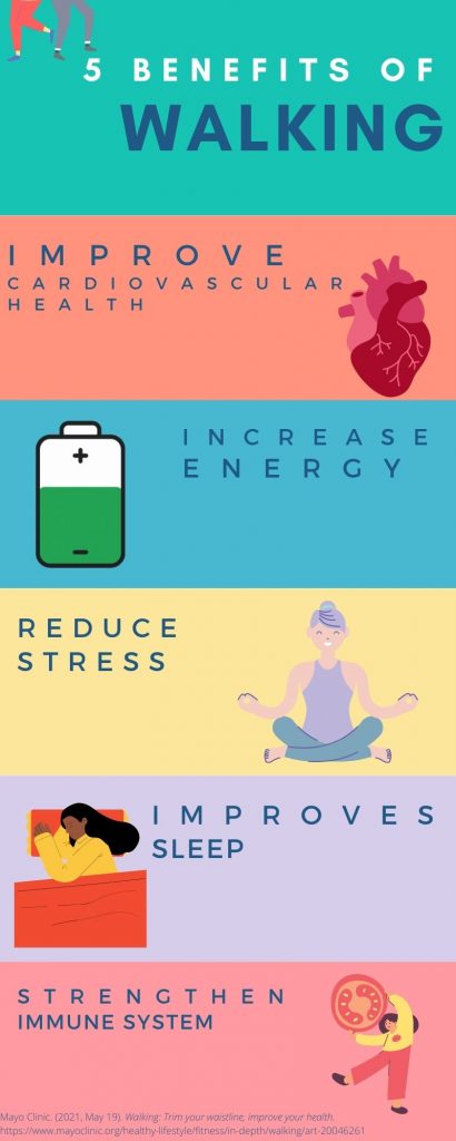
Mayo Clinic. (2021, May 19). Walking: Trim your waistline, improve your health. https://www.mayoclinic.org/healthy-lifestyle/fitness/in-depth/walking/art-20046261
Great job on your infographic.
You kept it very simple which is what our text suggests that we do. Your graphics did a great job of mirroring your points on each of the 5 benefits of walking!
Canva seems to be the winner on the websites that have been used a class so far. Great information on canva and being honest with your use.
I really like your use of colors. I also like the way your lines are spaced. It feels very natural.
I also really like your color choices! I also like the idea of having your students decide, much like we did, which tool they would like to use. I want to go back to Easel.ly and play around with that one some more, myself. Great job!
I love it! It’s simple and to the point. I like that your use of color was to separate each point. I also love walking and movement and feel it is so beneficial. I think your infographic would convince someone who may not walk often to get out and try it! Your idea for a whole school poll would be fun! It would be so interesting to see what the results would be. It could also be a great way to get a feel on what type of library collection would be desired in your school community.