I used Easel.ly to create my infographic however I wish I would have used Piktochart because it offers more options in graphics and background. The most tedious part was lining up the pictures and the titles underneath. It was very hard to size everything and I had to print to see that some items were not lined up appropriately. I always find printing useful because it allows you to see what it looks like in real size. I think Easel.ly is a great way to get your feet wet with infographics because the options are limited.
If I was teaching this to students I would want them to have a plan of what is the most important information that they want to share in an infographic and maybe even sketch something out beforehand of what they want it to look like. This will better help brainstorm and develop ideas then might be found by just starting from scratch in the program. I had an idea of what i wanted to do in this program before I started. This would be a great tool for students to learn about a subject and how to showcase what they learned visually. I can see using this in History class to timeline events or a Science Class to show the cause and effects of something. For English class, this could be used to summarize a book or story they have read. The possibilities are endless.
I used Canva and it showed a red line any time I moved a caption in line with the previous captions I had already written. I found that SO helpful, otherwise I would have been in the same boat as you and really frustrated! Especially after reading in our textbook about how our eyes spot when things are out of line easily.
YES! I loved this aspect of Canva. It’s one of my favorite things in Google Slides too, as will even help me space things perfectly.
I also found Canva an easier tool for lining up items. But I think that can be an area where you can get really bogged down in making everything perfect, so I agree that students would need help to avoid that. I would with elementary students so they definitely need some kind of scaffolding so that the information they want to share doesn’t get lost.
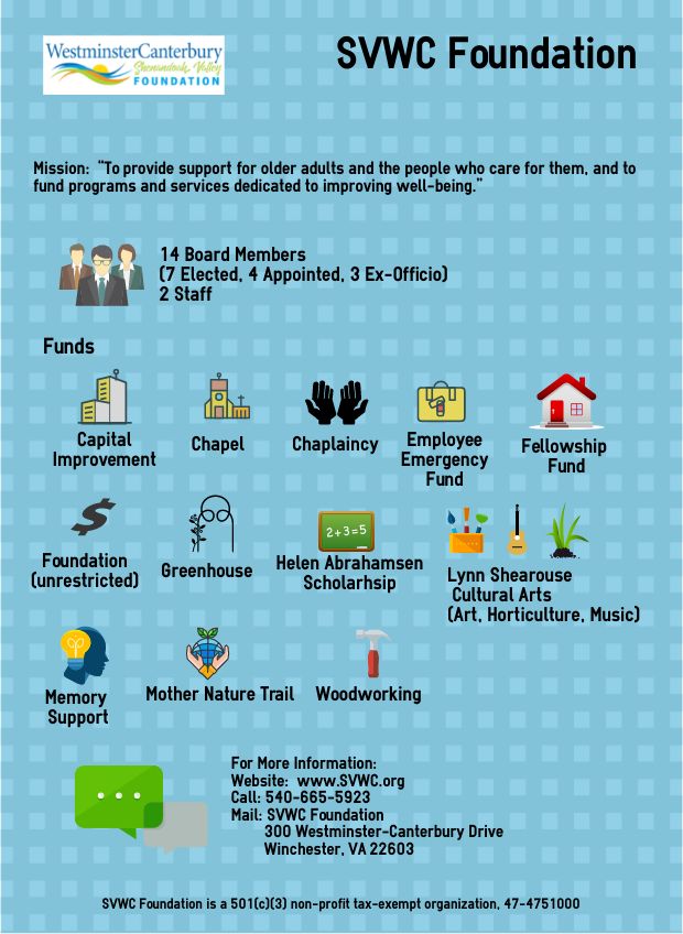
I like your results here as well as the ideas behind the organization you’re telling about. You’ve done this nonprofit proud!
I think sketching it out before making it online is a great idea! Then you’re not trying to plan and create with the digital tools all at once.
This was also something that struck my attention when reading this post. It made me think about how infographics could fit into the brainstorm, draft, write, revise process.
Your idea about having the students sketch out their ideas first is a wonderful idea. Easel.ly does have limited options for images. That was one of the reasons I decided not to use it for this assignment, but you have made great use out of the program.
I think having the students brainstorm their idea first is an great suggestion! I was overwhelmed with what I wanted to create and I think sketching it out first may have helped. I agree with Easel.ly having limited options. That was why I went with Piktochart. The tools were similar, but Piktochart had many more options. Great job!
Lining things up precisely was a little tedious!