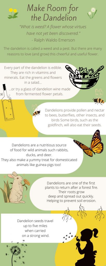
If I am honest, I really struggled with our sandbox project this week. I had a difficult time balancing the visuals and keeping to the idea that “the only rule concerning the display of data – besides telling the truth – is simplicity (Reynolds, 2014, p 152).” The image you see above is a scaled down version of previous drafts. I fear it is still too busy. Too loud. Too full of clutter. I have tinkered and played with my infographic for the better part of the week. But no matter what I do I can’t seem to get it quite right. I have saved, uploaded, deleted, edited, and uploaded the image at least a dozen times. Every time I think I’ve got it where I want it I wind up taking it down again.
My infographic on dandelions was created using Canva. Of the three tools it is the one I spent the most time exploring. In my opinion it is the best of the three. I found it intuitive and easy to navigate. It also had a far superior selection of free images to use. The search bar was useful and offered me many interesting choices. Under settings I discovered I could filter out paid images. For my infographic I decided to use an analogous color scheme. They yellow came from a photo I took of dandelions in the park near my house. I used Kuler to extract the shade I wanted. The green was in the palette offered in Canva. Together they just felt like a dandelion to me. I limited my images to black and white then sprinkled in a few pops of color in the same tones to create an accent. My intent for the analogous color scheme was to create a “harmonious” look with the “very effective yet underutilized method” Reynolds discussed. (2014, p 74). I used two different sans serif fonts. The title is in Kite One. I chose it because it is simple and easy to read but it has the slightest bit of a tilt to it. It put me in the mind of a dandelion puff caught on the wind. The rest of the text is in two different sizes of the same font. Once again I reached for that idea of harmony (Reynolds, 2014, p 42).
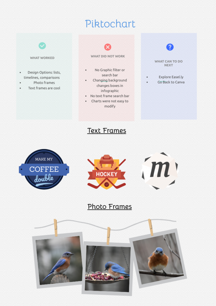
I was irritated by Piktochart. I deleted project after project. In the end I vented my frustration by using one of the comparison templates to highlight what worked and what didn’t. The most frustrating part was that there was no way to sort images. There were free images. But wading through them to find what I wanted was an impossible and time consuming task. There were some interesting features, however. I liked the text frames and photo frames. I enjoyed playing with them. I believe I would use this platform almost exclusively for photos and not rely on their stock of images.
As frustrated as I was by Piktochart I was even more annoyed by Easel.ly. It did have a search bar which seemed like an improvement. But my searches returned only a few images. And frankly, those images were uninteresting. Many search categories were completely empty. Again and again I was invited to sign up and pay to use their full features. Something that immediately made me think it would be difficult to see in a classroom setting. In the end I got around the issue by creating an infographic that used no images whatsoever.
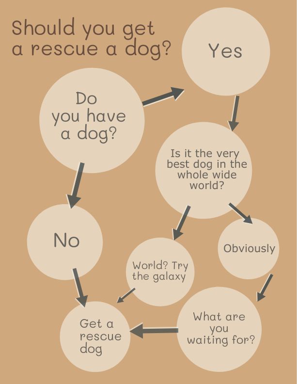
Even with this simple, image free template I was frustrated. There were extremely limited choices for the background. They were all too loud and busy. Eventually, I chose to return to the Kuler website. I used an image of my own rescue dog, Cody, to extract a color palette. Even then I was disappointed. The template only allowed me to change the background. Not the circles. There was a nice range of font choices, however.
Despite my frustrations and struggles I did enjoy the task of creating an infographic. I can see many uses for it in a classroom. As I played with the tools I imagined students using them to break down the plot of a story or to create character sketches. Students could also use it as a project to introduce themselves to their classmates. Or to interview each other and use the tools to present introduce their classmates. In a library I pictured using the tools to create infographics highlighting authors and their work as well as award winning books. Truly, there are as many possibilities as there are templates!
Reynolds, G. (2014) Presentation zen design (2nd ed.). New Riders/Pearson.
Marta, I found myself similarly frustrated with Easel.ly. I learned more about dandelions than I ever thought to know. I think you did achieve harmony with your infographic. I found it flowed well and I liked the graphics you used.
Nice job! I liked the images you chose and learned a lot about something I pluck out of my yard the instant I see one. The balance may be improved if you reduce the size of the font in your quote because there does seem to be a lot of text at the top. Other than that (and the slight shift in the bottom textbox) I think it looks great.
I think you are right! I saw that bit of green in the last word box after I posted. I was soooo mad at myself for missing it!