Design Idea File 1

The False Illusion by Andre Boto

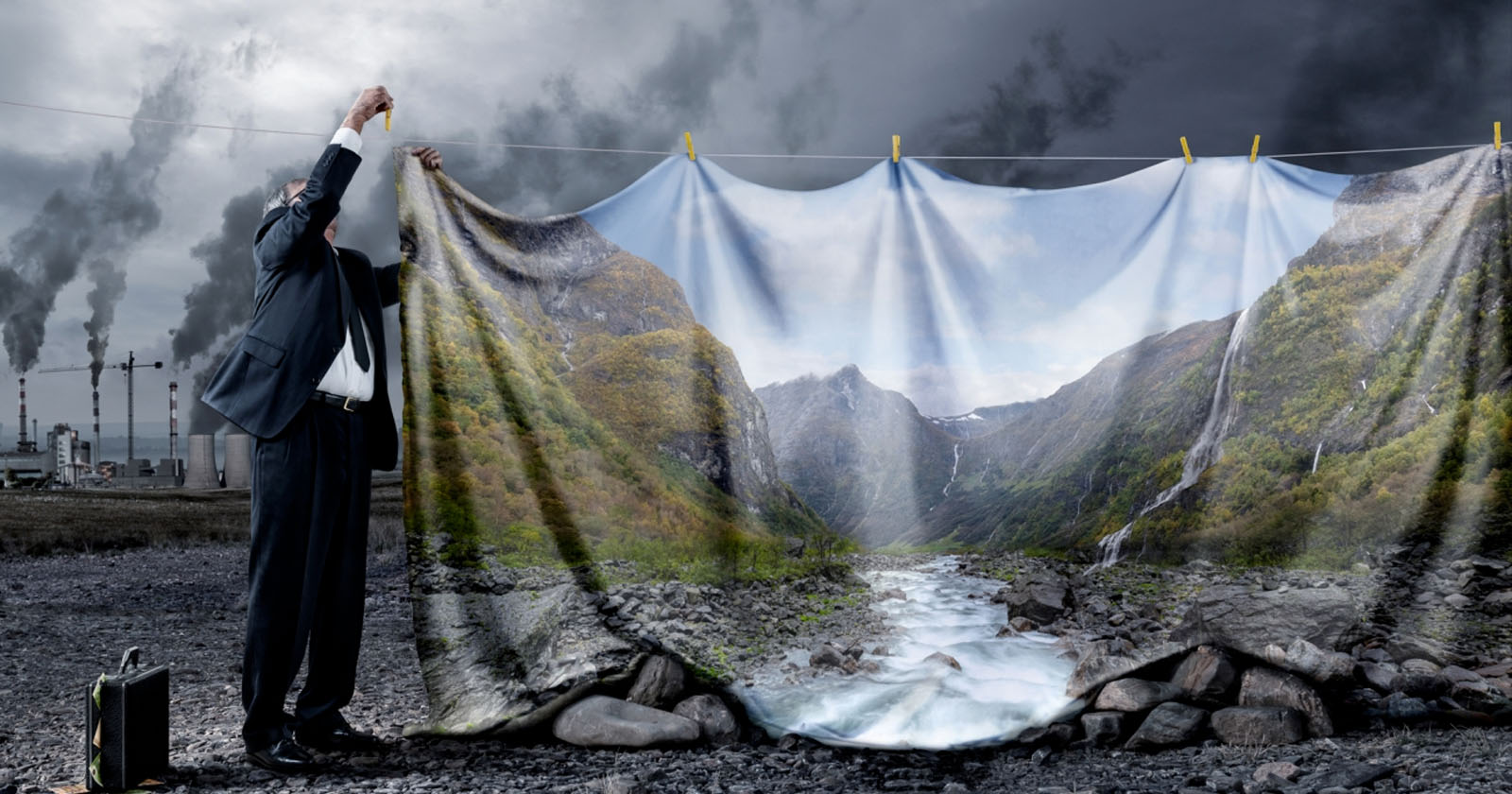
The image above conveys a strong message on capitalism and climate change. Pictured is a man hanging up a tapestry depicting a stream, but behind this is the gray, dismal scene of factories and pollution. The primary message I examine from the photo is how government officials, higher-ups, CEOs, and other people in positions of power have been disguising the consequences of mass production on our environment to continue making a profit. They keep telling us that climate change is not real, but it is, and it is here.

What I love about this picture is how you can interpret so many details through its design. The placement of each components is spaced so that you can clearly see what is happening, while also being able to discover more when looking closer; for example, you see the businessman but then look down by his feet and their is a briefcase, but look closer and you see that it is stuffed with money. These details strengthen the statement.

Colors play a crucial role in evoking emotion from the audience. Here, we have a stark contrast between the bright colors of the false and the grey, depressing reality. It shows us the sad truth of what’s to come. It also communicates that corporations and their carbon emissions are the evil culprits. Using these elements, the creator can portray the seriousness of the issue, which should ignite feelings of fear, anger, or sadness in response to climate change. And hopefully, the artwork will inspire people to rebel and stand up for themselves and the planet.

This image won the overall winner title at the 2022 Creative Photo Awards.

WordPress Blog 1

August 31, 2022

What experiences, if any, have you had designing and/or developing print or digital documents that integrate words and images (brochures, newsletters, flyers, reports, web sites, etc.)? Please list and describe any projects you have worked on and the technologies used to produce them. What are your expectations in taking this class and what do you hope to accomplish? What, if anything, makes you nervous or unsure in thinking about this class? 

My experience with designing is pretty short and straightforward. I have used Powerpoint and Google Slides repeatedly throughout my education, as well as Word and Google Docs. However, within these applications, I still don’t know half of what you can do within them. I have made a website on WordPress once before to create an e-portfolio. I have also used Canva and Prezi a few times in the past, but those are still very confusing and new to me. While I was in high school, I made brochures and flyers for class projects or upcoming events, but these were done using templates provided by Google docs.

I expect to learn how to operate design software and editing practices in this class. I want to understand these systems and apply them to my assignments. Editing photos and videos has always been something I wanted to learn, however, I have never been compelled to teach it to myself or buy applications. Visual rhetoric is critical, so I hope to learn tools to aid the presentation of my research in this class.

I am nervous that there will be a lot of steps to remember or hidden areas where you would find tools; I am forgetful so if there are tools within a tab under a tab, I’m afraid I will forget how to access them. I’m also worried that my aesthetic might not be what other people like and about the rules that are implicated in designing a professional document.