by Mel Frizzell, Special Collections Assistant
I remember about a decade ago watching commercials on television featuring live lions and always wondering whether I was seeing a commercial for ODU commercial or one for Food Lion. It’s not surprising given that both ODU and Food Lion have a lion as a mascot, and both used lions in their commercials at the time. So, I wasn’t entirely surprised a while back when I stumbled upon a 1986 article in the Mace and Crown that expressed concern and controversy over ODU’s then new logo and comparing it to Food Lion.
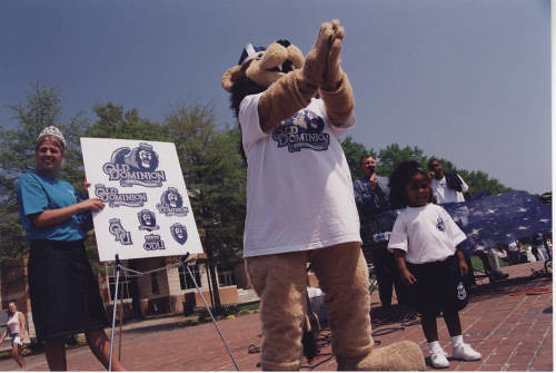
Back in 1986, ODU’s University Relations department figured it was time for a new University logo. With a new ODU President, Joseph Marchello, and ideas of a new era at ODU, a professional corporate design firm was sought out to create a “regal” logo for the University. ODU’s previous logo, sometimes known as the “racetrack” logo had been created in 1973 by Robert McCullough who was chairman of the ODU Art Department at the time. The 1986 logo was created by Glenn Monigle and Associates. The 1986 logo featured an Old English style lion like the kind you see on crests and shields. It was supposed to evoke a feeling of our connection with the College of William and Mary and “Old England.” New ODU colors were also instituted – a dark royal slate blue and silver. Before that time, ODU used a Columbia blue that wasn’t necessarily consistent across groups and departments on campus.
The new logo was voted in on October 16, 1986, by the ODU Board of Visitors. All was well and fine with the new logo except for one thing – neither the student body nor the faculty had been consulted about their opinions of the logo. Supposedly a few “respected” students and staff had been given the opportunity to share their opinions of the logo, but no one really seemed to know who they were or what made them more “respected” than everyone else. The Mace and Crown conducted an informal poll of readers that suggested the majority of students hated the new logo. The Faculty Senate unanimously voted that ODU’s Board of Visitors should reconsider their decision and include faculty and students in the process.
Criticisms of the new logo were many. Some thought the new logo looked just a little too much like the Food Lion logo. Others called it the “screaming chicken” logo. Many thought the logo should have been designed in house by the Art Department or by art students. Most felt that students, faculty, and staff had been left out of the decision-making process.
Despite objections, the new logo was here to stay. It remained ODU’s official logo until 2001 around the time when Roseann Runte became ODU’s seventh University President.


